
USAA Real Estate App Microcopy
Role: UX writer
Challenge: USAA offers a real estate agent finder tool to help home buyers and sellers find the right agent. After launching the tool, they found that there was significant drop-off—40%—on the final screen of the experience. The product team looped me in as the sole UX writer to investigate and help find a solution.
Timeline: 1 week
Approach: There wasn't a content strategist or UX writer on the original team, so I was briefed by the UX lead and information architect, who had handled the labeling and some microcopy. They walked through each screen with me in Sketch, explaining the experience. Essentially, the user would answer several questions, and based on their responses would be paired with up to three agents that best suited their needs. After I understood what we were trying to achieve at the highest level, I had some questions:
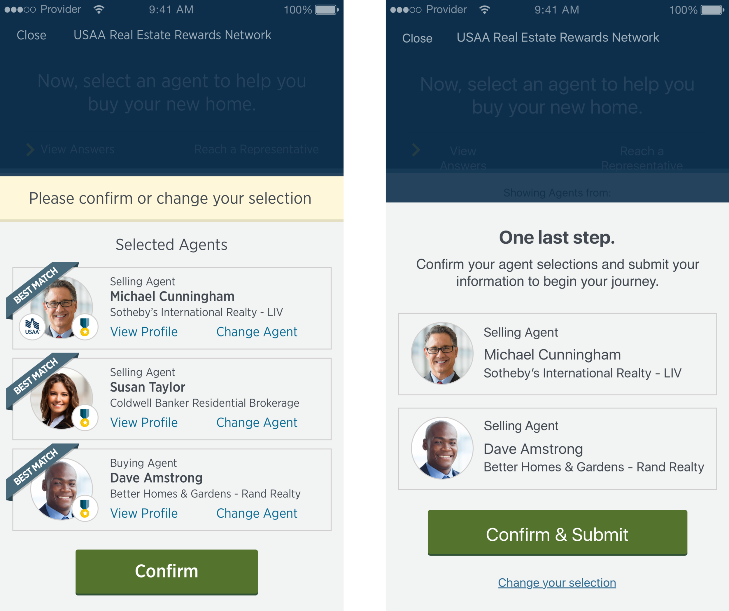
BEFORE (LEFT) AND AFTER (RIGHT)
• What, specifically, happens after they tap/click on Confirm? Will their information be sent somewhere, and they'll hear from the agents within a certain timeframe? (Yes)
• Haven't they done enough to ensure that they're (probably) picked the right agents? This is the last step for them—all their hard work answering lots of questions is going to pay off soon! Do we need to make this all about the agent selection? (No)
• Isn't the user taking two actions here: confirming their agents AND submitting their information? (Yes)
The answers to these questions gave me the extra context I needed to understand the problem and begin ideating some solutions. But before I dove into writing, I had some architectural and design ideas:
• The style of the instructional text (pale yellow bar) veers toward error state. It doesn't set the tone for a final submit experience—and we need a little more space to explain what's happening on this screen (two things, which won't be clear immediately). Can we absorb the content into the main screen area, and add a headline and subhead text style?
• Can we remove the "View Profile" and "Change Agent" links? If changing the agent is an unlikely scenario, then it's probably safe to de-emphasize. Can we easily enough replace it with a catch-all CTA to change any selection?
The team agreed with these edits, and I moved on to writing. I came up with a few different approaches:
Option 1
Your journey awaits.
Send your information to finish your selections and begin your move.
[Send & Finish] Change your selection
Option 2
These agents are ready for you.
Confirm your agent selections and submit your information to begin your journey.
[Confirm & Submit] Change your selection
Option 3
One last step.
Confirm your agents to send your information.
[Confirm Agents] Change your selection
After sharing with the team, we all had the same headline preference: option 3. "One last step." is clear, concise, and unambiguous. Exactly what we were looking for. Our preferences on subhead and CTA language varied, but ultimately the language in option 2 was the most accurate and easy to understand. So we ended up with:
One last step.
Confirm your agent selections and submit your information to begin your journey.
[Confirm & Submit] Change your selection